HealthSTAT:
Health Students Taking Action Together
For over eight years, I advised this student-led nonprofit and its affiliates on identity and messaging. I bolster their grassroots campaigns by providing resonant concepts, distinct graphic design and concise copy editing (often translating from industry-speak to target audience).
By 2009, this health care reform group had outgrown both its name and its image.
To better convey inclusivity and wellness, the organization— founded as HSTAT—officially renamed itself HealthSTAT. One step further, I suggested separating the tag line into an almost poetic "students" | "taking action" | "together" to underscore these core qualities.
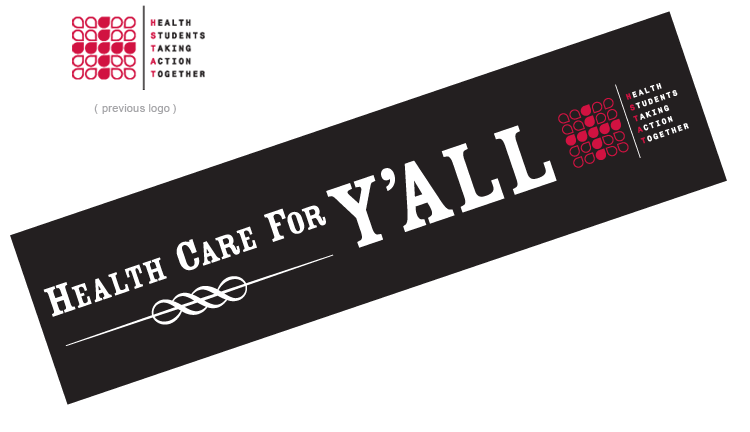
As for their visual identity, the exisitng logo was often perceived as "too clinical" or mistaken for the Red Cross. With this in mind, I crafted a mark that was reminiscent of the original yet projected the youthful energy, interdisciplinary approach and professional results of this genial group.
The droplets, like its members, are at once coming together and reaching out; "health" is the common goal.
The HealthSTAT rebrand was inspired by the annual report I designed the year before, particularly by its bold images, personable tone and assertive headlines—all testaments to HealthSTAT's presence and authority in the field of reform.
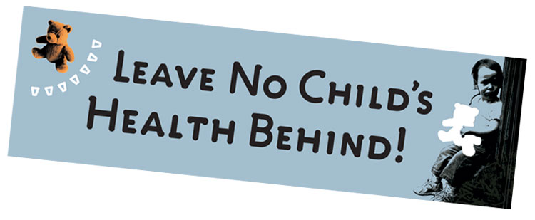
One of the most imperative campaigns I have worked on so far was to "Save Grady" when this iconic hospital—the only Level 1 trauma center within a 100-mile radius of Atlanta and the training ground for Georgia's future doctors—faced closure.
HealthSTAT intervened by educating and mobilizing the community. From postcards to rally banners, fact sheets, programs and buttons, my designs were commanding and cohesive across the board (which broadcast very well and lent professional weight to their messaging). Furthermore, I clearly outlined steps for citizens to take action. Thankfully, the hospital is still open.
One of the affiliates with whom I have worked is PictureRx—I illustrated over fifty medical conditions as part of a larger project addressing patient noncompliance. These icons help patients identify and differentiate their prescriptions which enables them to take their medications correctly.
A more academic assignment was Context—an online medical journal and research community for whom I developed a visual identity and web site. The engraved "e" within the masthead expressed the academic and electronic aspects of the publication. The colorful images (many of which are my photographs) conveyed accessibility and enthusiasm.
Continue scrolling to browse the HealthSTAX…
Health Students Taking Action Together
For over eight years, I advised this student-led nonprofit and its affiliates on identity and messaging. I bolster their grassroots campaigns by providing resonant concepts, distinct graphic design and concise copy editing (often translating from industry-speak to target audience).
By 2009, this health care reform group had outgrown both its name and its image.
To better convey inclusivity and wellness, the organization— founded as HSTAT—officially renamed itself HealthSTAT. One step further, I suggested separating the tag line into an almost poetic "students" | "taking action" | "together" to underscore these core qualities.
As for their visual identity, the exisitng logo was often perceived as "too clinical" or mistaken for the Red Cross. With this in mind, I crafted a mark that was reminiscent of the original yet projected the youthful energy, interdisciplinary approach and professional results of this genial group.
The droplets, like its members, are at once coming together and reaching out; "health" is the common goal.
The HealthSTAT rebrand was inspired by the annual report I designed the year before, particularly by its bold images, personable tone and assertive headlines—all testaments to HealthSTAT's presence and authority in the field of reform.
One of the most imperative campaigns I have worked on so far was to "Save Grady" when this iconic hospital—the only Level 1 trauma center within a 100-mile radius of Atlanta and the training ground for Georgia's future doctors—faced closure.
HealthSTAT intervened by educating and mobilizing the community. From postcards to rally banners, fact sheets, programs and buttons, my designs were commanding and cohesive across the board (which broadcast very well and lent professional weight to their messaging). Furthermore, I clearly outlined steps for citizens to take action. Thankfully, the hospital is still open.
One of the affiliates with whom I have worked is PictureRx—I illustrated over fifty medical conditions as part of a larger project addressing patient noncompliance. These icons help patients identify and differentiate their prescriptions which enables them to take their medications correctly.
A more academic assignment was Context—an online medical journal and research community for whom I developed a visual identity and web site. The engraved "e" within the masthead expressed the academic and electronic aspects of the publication. The colorful images (many of which are my photographs) conveyed accessibility and enthusiasm.
Continue scrolling to browse the HealthSTAX…
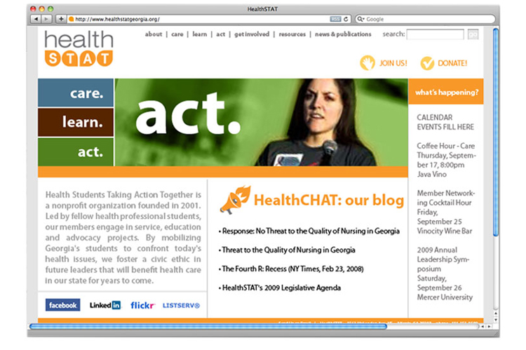
logo and web site redesign for HealthSTAT
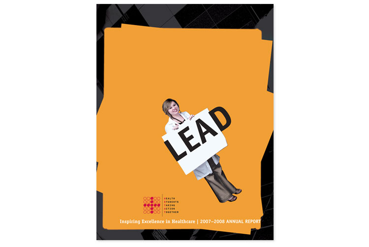
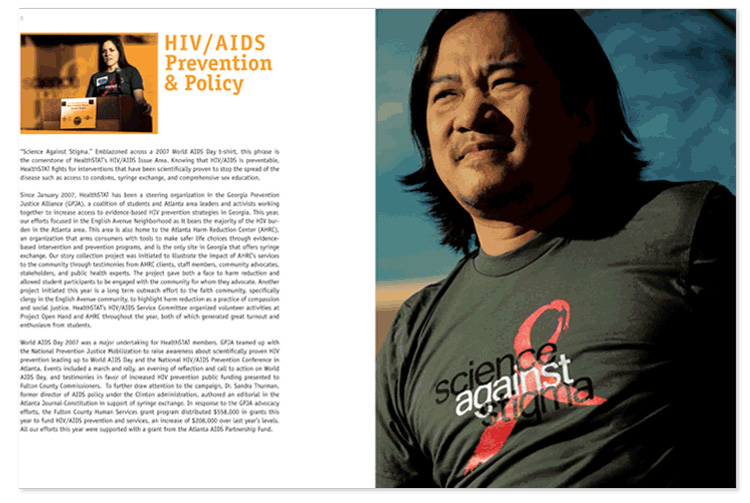
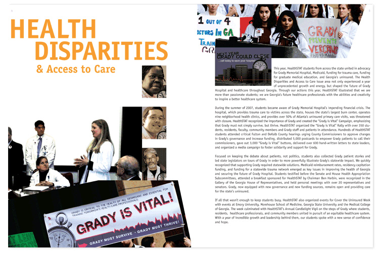
cover and spreads from a 24-page, perfect-bound annual report
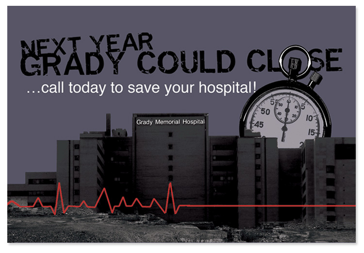
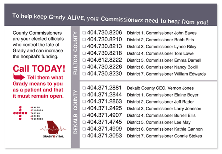
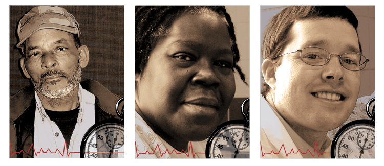
"Save Grady" sample postcards
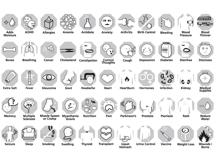
<PictureRx> illustrations help patients to identify and properly take their medications

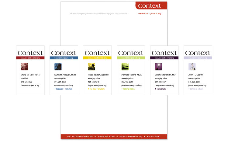
Context logo design and identity materials
